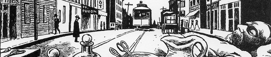
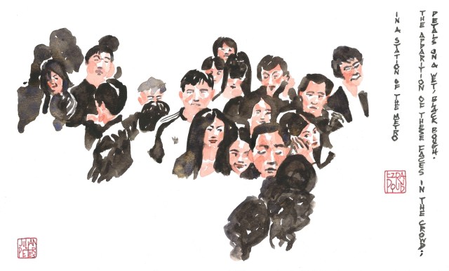
Two illustrations inspired by the American poet Ezra Pound’s famous and famously short poem, “In a Station of the Metro,” first published in 1913.
I have no experience with Chinese and Japanese brush painting, and it is known as a technique that takes at least a whole lifetime to perfect, but it’s the idea that counts. Perhaps I will return to this theme once I’ve had a little more practice with this painting style.


Mr. Peters, are you selling prints of these?
LikeLike
Thanks for your interest. For any questions about prints, please contact me at info@jpeterscomics.com
LikeLike
I was actually wondering why you drew a western father figure for that little boy … Now it makes sense that it didn’t grasp any ( sense). Sorry ! But see, we always look for /at what we want to see and I guess I was looking for/at a little tenderness in that hectic daily scene …
LikeLike
Beautifully done. Each of the persons, in so few brush strokes, exudes character and personality.
The illustration is well in keeping with the extra-short, concise, style of the poem, so pure and uncluttered.
LikeLike
Thanks! so much of East Asian painting is about minimal brushstrokes. I guess the ultimate goal would be to capture something like an individualized face in a single stroke.
LikeLike
I love the ease with which you switch from one style to another, from a very classical one for poems like Prufrock to manga for When you are old, watercolour or white on black, and now Asian influnces. Lovely and inspiring.
LikeLiked by 1 person
Nice ! I particularly like the younger boy , who is sleeping peacefully : his face is really delicate and cute. Not to mention his little hand gently holding his father, which adds a little tenderness to this daily transportation scene.
LikeLike
Thanks! It’s interesting that you read the image that way. The little boy is actually meant to be a young woman looking at her cell phone. but admittedly
I made her head a little too small -or the man’s head a little too big!
LikeLike