
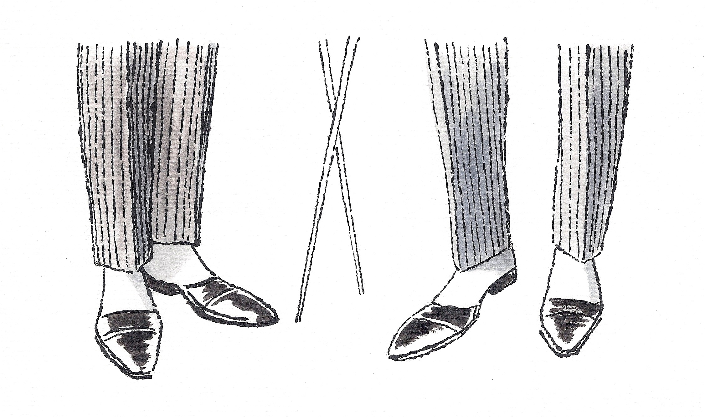
 Here’s my illustration for an article appearing today in Aklasu Online Men’s Magazine on the subject of splatterdashes, or spats. Here’s hoping Justine Smith’s insightful piece helps contribute to the revival of these marvelous fashion accessories. I doubt I would ever be able to wear them myself, however, given the great difficulty I’d be sure to have in keeping them white. An ironic liability, I suppose, given spatterdashes original function as a means of keeping one’s shoes clean, but everyone knows that, when it comes to making an elegant impression, even just a dash of spatter dashes spatterdashes (sorry).
You can read the article here: https://aklasu.co/spats-evolution-fashion-icon/

Julian blague sur son blogue.
Je voulais commenter sur la reine du slapstick (Hepburn) toute en courbes et sur la grande maîtrise du trait pour la dessiner alors que Grant est plutôt stiff 🙂 avec autant de maîtrise dans le trait, la raison pour laquelle j’écris là-dessus ici, c’est que tu illustres des splatterdashes après les rois du slapstick. Et Shhhhlapp!
LikeLike
Very good! It’s partly also the case that Cary Grant’s character is a bit stiffer than Katherine Hepburn’s, or so I surmised from the photo I based the illustration on. So in a way the difference in line reflects the difference in personalities. That’s my story and I’m sticking to it.
LikeLike
That is also what I meant and it is right that you stick to your story. I was enjoying sounds. The spatterdashes are very chic, the crossing of canes is suggestive of … an added chic touch I guess. (camaraderie, rivalry, going with the flow and a unique moment in time) Love the angles, really.
LikeLike